
Hello, my little Kumquats!
Today's tutorial is based on a character from the movie Barbarella - i can't for the life of me find any still photos of this woman but she had a shaved head with a feathered head-dress, and makeup which made her look rather bird-like.
This sort of look fits my features perfectly, what with my very beak-like nose and penetrating (some might say "creepily intense", ahem) eyeballs...
What i tried to achieve here is that unmistakable 1960s heavy-eye and nude-lip thing with a stylized fantasy twist. Like, y'know - Barbarella.

Beak-like nose
I'll go through each step in as much detail as possible and list all products used as i go along.
Ready? GO.
For this look, i used a combination of high-end and Indie brands i have tried and can recommend wholeheartedly for their quality, pigmentation and just general coolness factor. As an Indie perfumer myself, I highly encourage the support of Indie cosmetics companies - there are definitely a few good ones out there and i will eventually get to all my favourites on this blog.

Creepy, penetrating gaze
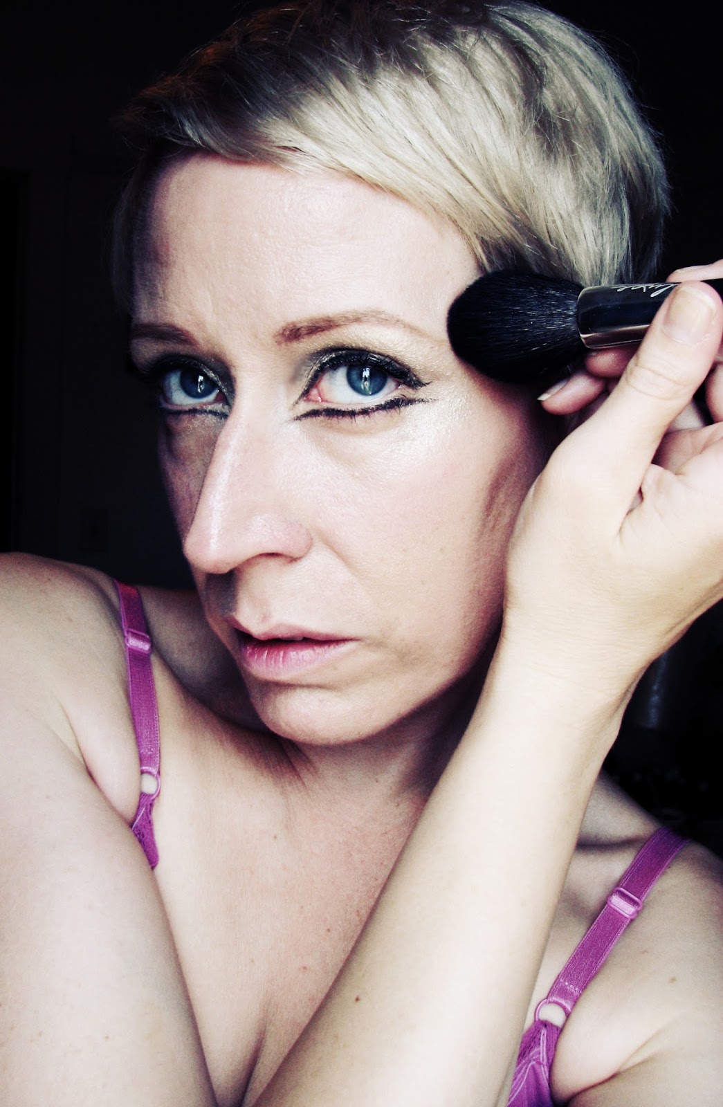
So to begin, the first thing i do - as always - is start with the eyes. As i mentioned in my last post, i like to keep foundation/blush/powder as the very last step in the process, as i don't like having to clean up fallout from the eyeshadow and reapply foundation/concealer. It's a waste of time, and creates an un-necessary step. However, for this look i actually wanted some fallout from the browbone/highlight colour so i concealed well under and around my entire eye area, just carefully brushing off any dark shadow that fell (which was barely any) and leaving the highlight fallout alone.
Before i apply any shadow, i prime the eyelids with my trusty Urban Decay Primer Potion. This step is essential; it keeps the shadow and liner in place all day, as well as intensifying the pigment of your colours. It is especially important when working with loose pigment, which i did today.
After applying the primer, i drew in my brows - because they are so blonde and sparse as to be practically invisible. I actually removed the pencil i used after getting all the shadow on and applied a darker shade; because i decided impulsively that the pencil i used was too ORANGE, plus i wanted a stronger brow. So then of course i had to re-apply the under-brow highlight shade and re-conceal above my brows.
I do not recommend this o_O.
Moving on, i used the lightest shade from the Chanel Prelude quad - but any very light, off-white shade will work - preferably with some lustre as this look is extremely high-gleam :).
Next, i used a medium-shade of cool taupe in the crease - the third-darkest shade in the Prelude quad was used here.

Before blending

Chanel Prelude - i used the top two shades
To achieve the crease, use a medium dome-brush, starting at the bridge of the nose and working outward in a C-shape towards the outer corner of the eye. Blend in with windshield-wiper motion with a large domed brush to soften.
Then, i used Urban Decay's Maui Wowie on the lid up to the crease, patting the colour in with a medium lay down-brush.
Blend again.

Maui Wowie by Urban Decay in the NYC palette. It's the colour underlined in red
Then, blend again.
Finally, i swept Sponge from Black Rose Minerals under the brows and above the crease - and as a highlight on the very tops of the cheekbone. This sort of ties the whole look together - with its super-visible shine and gorgeous, almost metallic gleam. Generally i am not a fan of loose pigment shadows because of all the fallout. BUT. I am a big fan of her colours, and have no problem making an exception to the rule where her products are concerned.
Plus - they are, i believe, almost all lip-safe as well, and can be used anywhere on the face. What's not to love about that? And for a look like this, fallout is actually preferable from this gorgeous high-beam colour. It adds to the sort of 1960s-version-of-futuristic thing i've got going on.

Sponge - Black Rose Minerals

1. Sponge , BRM
2. Medium-taupe from Prelude, Chanel
3. Maui Wowie, UD
I don't actually have all the shadows listed ON my eye in this photo, just the taupe - this is just a handy guide as to what i did next.
As the last step of for the eyes, we have the liner. Generally i'd recommend using a liquid liner for this, but i wanted to see, just for shits-and-giggles, how a cream-gel liner (in a pot, not pencil) would work. I used MAC's Added Goodness for this. It was definitely a bit more challenging and not as convenient as a liquid pen or brush liner, but it did the trick.

Crappy liner diagram
In this photo, you can see all the shadows at work here - check out that high-beam shine from Black Rose Minerals' Sponge! SO MUCH 1960's futuristic goodness.
In this diagram, i try to show you how i applied the liner. To achieve a good wing, i began with the purple line (which of course wasn't actually purple...er), placing my brush at the very outer-corner and drawing outward. Next, i drew the along the red line on top, again moving outward and connecting the two lines to create the V.
On the bottom lid, i started at the inner-corner moving outward - drawing a nearly straight line under the eye so the line touches the lower lid at the centre, and leaves a bit of space at the ends.
Now that we're done with the eyes (and i've succeeded in thoroughly confusing you with diagrams and lists), i cleaned up any unwanted fallout and applied my foundation. For this look i used Rouge Bunny Rouge in Coconut Parfait, which is a bit on the sheer side, to give a more modern feel to the look as opposed to the typical 1960s pan-makeup thing. This let my skin show through a bit, just diffusing out any imperfections.
Next i applied blush, using Lilith by Detrivore Cosmetics. Now, Lilith might look like a scarily-bright, sparkly purple-with-silver-shimmer loose blush in the pot to some. However, on the skin it is so sheer and pretty - more lilac-pink than purple - and it's so finely milled and beautifully pigmented that it's almost impossible to overdo it!

Lilith blush by Detrivore Cosmetics
I applied the blush to the apples of the cheek, sweeping it up and around in a C-shape to the temples to give a pretty flush. I love the way these blushes go on - the sheerness and buildability of this colour is to die for.

Helpful blush diagram o_O
It's really staring to come together, now!
Lastly, we have the lips. Now, i'm all for retro- 1960s pale lips - but on me, if i go TOO pale, i look like i have leprosy. Or something bad that you wouldn't want on your face. Whatever.
I DID want to keep the lips pale with just a barest touch of pink - and for that i used my Precious, Blush Nude by Tom Ford. This colour...i just - i can't even.
YES it's an expensive lipstick and YES i am utterly ashamed of myself. Except i'm not. Let's face it - ALL makeup is a non-essential item, so all of the money we spend on it is frivolous, superfluous and un-necessary.
Unless you're a makeup-addict, in which case it's totally necessary and we must have it, have it now! *crushes fist into palm*

The Precious
I began by blending a bit of my foundation into my lips, then lining with a light shade - Chanel Clair - which is actually the eyeliner i used on my waterline here as well (which i totally forgot to mention - shhhh). And using this pale, peachy shade to create a bit of fullness on the lip, i committed the massive makeup faux pas of lining outside my lip-line.
*waits for fainting and gasps to subside*
Except here's a little secret for you - it's NOT a makeup no-no if you use a fleshy shade lighter than your natural lips. This actually creates a slight highlight around the lip-line, which creates the illusion of fullness. Combined with the Blush Nude, it looks very pretty indeed.

Lip-liner faux pas - oh, horrors!

and, all the pretty
So, there you have it! I hope you enjoyed this tutorial as much as i enjoyed doing it - it was fun walking around all day in bird-girl mode, even if i only ventured as far as the refrigerator with it on.
If you enjoyed this look, please follow/like/share what-have-you. It gives me warm fuzzies.
Thanks, and i'll see you soon!
Hey girl! Saw your comment on my confessions post! I'd love to see you link up for makeup monday! Its LIVE today here: http://www.agapelovedesigns.com/2013/07/makeup-monday-linky-party.html
ReplyDeleteSimply copy the url of the post you want to link up and paste it into the linky widget (at the bottom of my post) and fill in your address and name of blog post and the widget will help you do the rest! Feel free to link up more than one post! ♥
Fantastic, thank you so much, Maria-Isabel! I'll go there now and get started :). Thanks for commenting and getting me the info on Makeup Monday <3
ReplyDelete